
What Makes a Watch Look Premium in Real Life? 8 Details Most Buyers Notice Late
What Makes a Watch Look Premium in Real Life? 8 Details Most Buyers Notice Late
A lot of watches look impressive in product photos. Sharp lighting, clean backgrounds, and perfect angles can make almost any design feel more expensive than it really does.
But real life is different.
A watch is usually seen while you are typing in the office, walking outside in daylight, reaching for coffee, sitting at dinner, or adjusting your sleeve during a conversation. In those moments, people do not judge a watch the way they do online. They are not zooming in on one detail. They are reacting to the whole impression.
That is why this question matters so much: what actually makes a watch look premium in real life, not just in controlled photos?
Many first-time buyers think the answer is simple. They assume a larger case, a shinier finish, or a more complex dial automatically makes a watch look expensive. In reality, the watches that feel more premium in person usually get a lot of small things right at the same time. Proportion, finishing, bracelet comfort, dial control, crystal clarity, and how the watch fits daily wear all matter more than people expect.
If you have already read our watch accuracy explained article or gone through a guide to choosing the right watch size, you already know that a watch is never judged by specs alone. Real quality is usually felt before it is fully explained.
Quick Answer
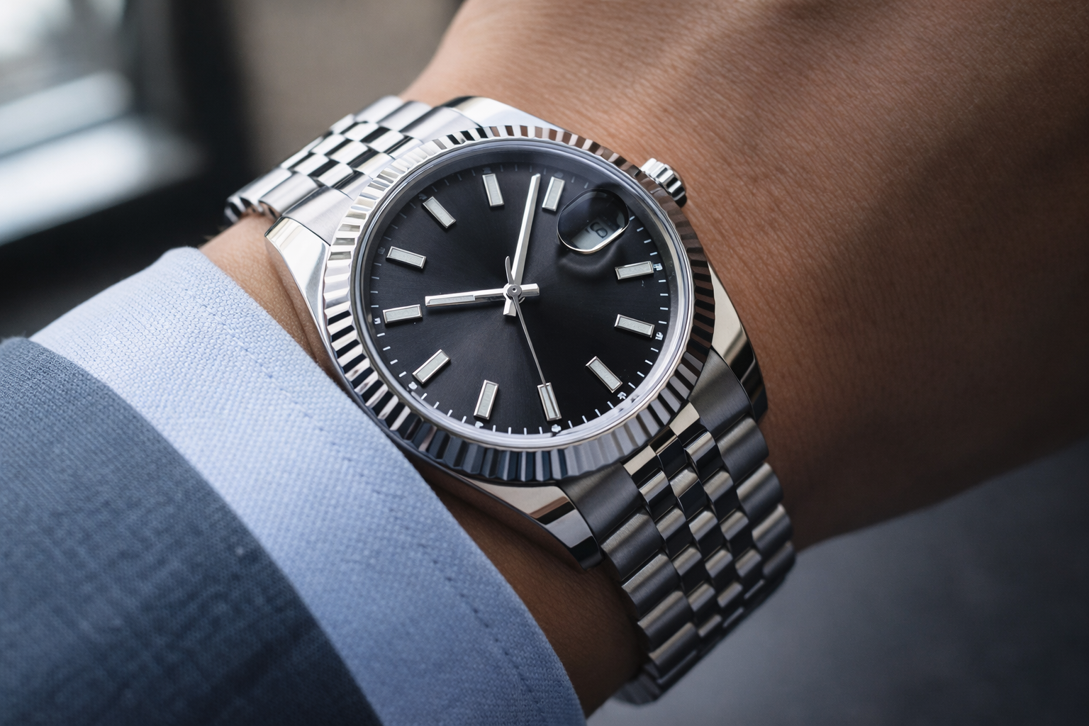
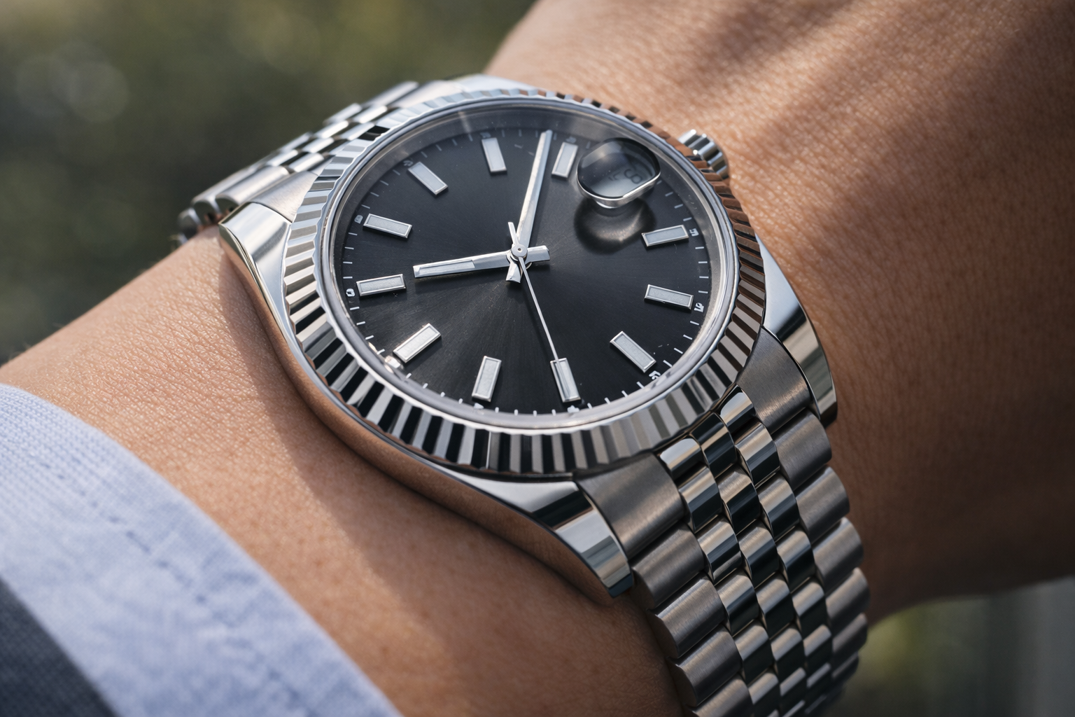
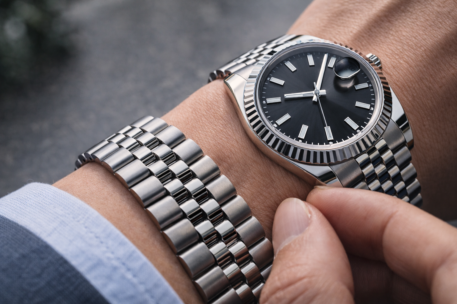
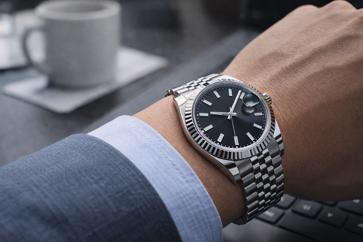
A watch usually looks premium in real life when it has clean proportions, controlled finishing, good bracelet or strap fit, clear dial execution, balanced light reflection, and strong wrist presence without looking forced. Most buyers do not notice one single detail first. They notice the overall refinement that comes from several details working together.
Why Some Watches Look Better in Person Than They Do Online
This happens more often than people expect.
Some watches look average in photos but much better once worn. Others look striking online but less convincing in person. The reason is simple: premium feeling is often created by depth, balance, comfort, and light handling, and those things do not always translate well in flat images.
In daily life, a watch usually gets judged in situations like these:
- under office lighting
- near a window in daylight
- while moving the wrist naturally
- with a shirt cuff or jacket sleeve
- at normal social distance
- after several hours of wear rather than one quick glance
That is why real-life quality is not only about design. It is also about how the watch behaves in normal conditions. This is exactly why learning how to choose the right watch for everyday wear matters so much. A watch that feels premium for ten seconds is not the same as one that still feels premium after a full day.
1. Good Proportions Usually Matter More Than Fancy Design
One of the biggest surprises for new buyers is that a watch often looks more premium when it is well-proportioned, not when it is trying too hard.
A watch can have an expensive-looking bezel, textured dial, polished case, and lots of visual detail, but still feel awkward if the proportions are off. This happens when:
- the case looks too large for the wrist
- the watch feels too thick for its style
- the lugs stretch too far outward
- the dial opening feels too wide or too crowded
- the bracelet looks too narrow or too wide for the case
A premium watch usually feels visually settled. Nothing looks like it is fighting for attention. The size makes sense, the thickness makes sense, and the shape feels natural on the wrist.
This is one reason proportion is such an important part of first impression. If you have already worked through a watch size guide: case diameter, lug-to-lug, and thickness, you will know that numbers alone do not decide fit. But when proportions are right, a watch often looks more refined immediately.
2. Controlled Finishing Looks Better Than Overdone Shine
A lot of buyers assume shinier means more expensive. That is not always true.
In real life, overly polished surfaces can sometimes make a watch feel cheaper, especially if the reflections look harsh or uneven. A premium-looking watch usually has more control in the finishing. That means:
- polished surfaces are placed where they make sense
- brushed areas look clean and even
- transitions between finishes feel sharp but not aggressive
- the case catches light in a calm, intentional way
This becomes very noticeable outdoors or near natural light. A watch with poor finishing may look flat in one moment and too bright in the next. A better-finished watch usually feels more stable visually.
That is why a watch does not need to be flashy to feel expensive. In fact, one of the biggest lessons in understanding what makes a watch look expensive is realizing that refinement usually looks quieter than people expect.
3. Bracelet Feel Changes the Whole Impression
People often talk about how a watch looks, but bracelet feel changes how premium it seems much faster than many beginners realize.
If the bracelet feels:
- loose in the wrong way
- too light for the case
- sharp around the edges
- noisy during movement
- hollow at the clasp
- stiff instead of fluid
then the whole watch can feel less convincing, even if the dial and case look good.
This becomes especially obvious during real daily wear. In an office, a bracelet that shifts too much while typing starts to feel less refined. In hot weather, one that sticks awkwardly to the wrist can make the whole watch feel less polished. During commuting or travel, comfort matters even more.
A premium watch usually feels composed on the wrist. The bracelet does not distract from the watch. It supports the whole impression.
4. Dial Execution Is Often More Important Than Dial Complexity
A common mistake is assuming that a more detailed dial automatically looks more luxurious.
In real life, a cleaner dial with better execution often feels more premium than a busier dial with too many elements competing for attention.
People usually notice:
- whether the markers feel aligned
- whether the printing looks clean
- whether the hands suit the dial properly
- whether textures add depth or just clutter
- whether the date window looks integrated or awkward
- whether the dial remains easy to read at a glance
This matters a lot in close conversation, at dinner, or in office settings where the watch is seen from a short distance but not inspected like a product photo.
Sometimes a simple dial with strong balance and good finishing creates a more expensive impression than a more complicated dial with weaker control. That is also why a practical watch dial color and readability guide is often more useful than buyers expect. Readability and visual balance affect perceived quality more than extra decoration.
5. Crystal Clarity Quietly Makes a Big Difference
Crystal quality is one of the least discussed but most noticeable parts of premium feeling.
If the crystal creates too much glare, makes the dial look cloudy, or weakens the view from an angle, the whole watch can feel less sharp. Even if someone cannot explain why, they often react to it.
In real life, crystal clarity matters when:
- checking the time outdoors
- glancing at the watch in office light
- moving from indoor to outdoor settings
- viewing the watch at an angle
- looking at the dial under a shirt cuff
A clearer crystal makes the dial feel more open and more expensive. A weaker one can make the dial feel visually blocked.
This is one of those details buyers often notice late. They may not think about it on day one, but after regular wear, it becomes part of the overall impression.
6. Wrist Presence Should Feel Natural, Not Forced
A premium-looking watch usually has wrist presence, but it should not feel forced.
This is a very important difference.
Some watches try to create presence through size, shine, thickness, or aggressive design. Sometimes that works in photos, but in daily life it can feel too deliberate. A better watch usually creates presence through balance. It looks confident without trying too hard.
This is easiest to notice in settings like:
- office meetings
- smart-casual dinners
- formal occasions
- travel days when you want one watch to do everything
- situations where the watch is seen naturally rather than intentionally shown
A watch that feels premium usually looks like it belongs there. It does not need to announce itself too loudly.
That is also why choosing how to choose your first watch is not only about liking a design. It is about understanding whether the watch feels naturally right in real life.
7. Thickness Changes More Than Most People Expect
Thickness is one of those things that seems minor until you wear the watch for real.
A watch that is too thick for its design often feels less premium because it changes the whole silhouette. It may:
- sit too high on the wrist
- catch the cuff awkwardly
- feel heavier than expected
- look more bulky than refined
- lose some of the elegance the design should have
This matters even more for watches meant to feel versatile. A premium daily watch usually wears with less friction. It slides more naturally into office wear, commuting, casual outfits, and evening situations.
That is why thickness is not just a technical number. It changes comfort, proportion, and visual quality at the same time.
8. The Watch Has to Make Sense as a Whole
This is probably the biggest point of all.
A premium watch usually feels premium because everything works together.
Not just the dial.
Not just the bracelet.
Not just the case.
The watch feels complete.
That can mean:
- the dial suits the case shape
- the bracelet matches the visual weight of the watch
- the finishing fits the style
- the proportions feel coherent
- the watch looks right with actual clothing
- nothing feels out of place or overdone
This is also why two watches with similar specs can feel completely different on the wrist. One feels more convincing because the design language is consistent from start to finish.
That full-package feeling is hard to fake, and it is often what people really mean when they say a watch “looks premium in person.”
What Buyers Usually Notice Late
Most buyers do not notice these things immediately.
At first, they often focus on:
- case size
- dial color
- brand feeling
- bezel style
- how eye-catching the watch looks
Later, after more wear, they start to notice:
- how the bracelet moves
- whether the watch still looks balanced after hours
- how the crystal handles daylight
- whether the finishing still feels controlled outdoors
- whether the watch works with different outfits
- whether it still feels impressive without being overdone
That is why premium feeling often becomes clearer over time. It is not only about first impression. It is also about lasting impression.
How to Judge Whether a Watch Looks Premium in Real Life
If you want to judge this more realistically, ask practical questions:
1. Does the watch still look balanced in normal light?
Not studio light. Normal light.
2. Does the size suit the wrist naturally?
Not just head-on. From side view and real movement too.
3. Does the bracelet or strap support the design?
Or does it make the watch feel lighter, stiffer, or cheaper?
4. Is the dial controlled or just busy?
A premium look usually comes from order, not noise.
5. Does the watch still feel right after several hours?
This question matters more than many buyers think.
That is why a premium watch is usually easier to recognize after repeated wear than after one quick look.
Final Thoughts
What makes a watch look premium in real life is rarely one dramatic feature. It is usually a combination of clean proportion, controlled finishing, good bracelet feel, clear dial execution, strong crystal clarity, and natural wrist presence.
That is why some watches feel much better in person than they do online, while others disappoint once worn outside controlled photos. In daily life, refinement is not about one flashy detail. It is about how well the whole watch works together.
And in most cases, that is what people notice last.
FAQ
What makes a watch look premium in person?
Usually a mix of proportion, finishing, bracelet quality, dial clarity, crystal performance, and natural wrist presence.
Does a shinier watch always look more expensive?
No. Overdone shine can make a watch look cheaper. Controlled finishing usually feels more premium.
Does bracelet quality really affect how expensive a watch feels?
Yes. Bracelet comfort, fluidity, and clasp feel can change the whole impression very quickly.
Why do some watches look better online than in real life?
Because photos do not always show comfort, depth, crystal clarity, balance, or real-world light reflection.
Is dial complexity a sign of higher quality?
Not always. A simpler dial with better execution often looks more premium than a busy dial with weaker control.
